This was biggest rebranding project The Vegan Society has been through in decades. Research carried out by the society revealed that the audiences they sought to attract saw the society as outdated. Making veganism desirable and mainstream was key to the rebranding brief. The Society’s revitalised image brings their values to life and marks a new stage of growth. Updating the society’s sunflower symbol, it was important to create a fresh image which is relevant to the times and to create a consistent brand. It was also about showing the vegan way of life from a fresh perspective.
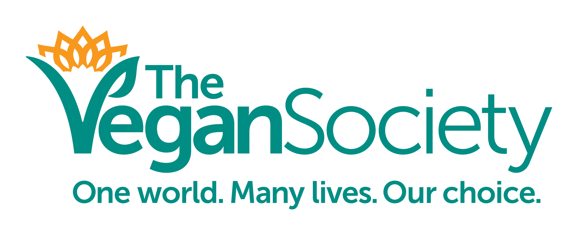
The new logo
The sunflower and the sun are now one. The earth has been combined with the energy and dynamism of the sun. Interlinked petals – or rays of the sun – symbolise unity and connection. Combining the two creates a more compact shape, simplifying the form but keeping the spirit of the sunflower. The sun is rising, signalling a new era for the society.
Leaving no gap between the words ‘Vegan’ and ‘Society’ reflects people working together towards a shared vision. The typeface is easy to read and appeals to a wider audience, offering both modernity and approachability.
A cool, professional shade of green was chosen, associated with health, growth, nature, and harmony. This is balanced with the orange of the sunflower and the rising sun, to represent the dynamic side of the Society.
The V is also designed to be used as a standalone mark, a strong symbol for the society and veganism.
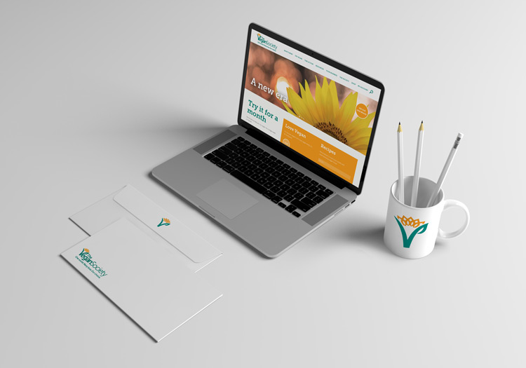
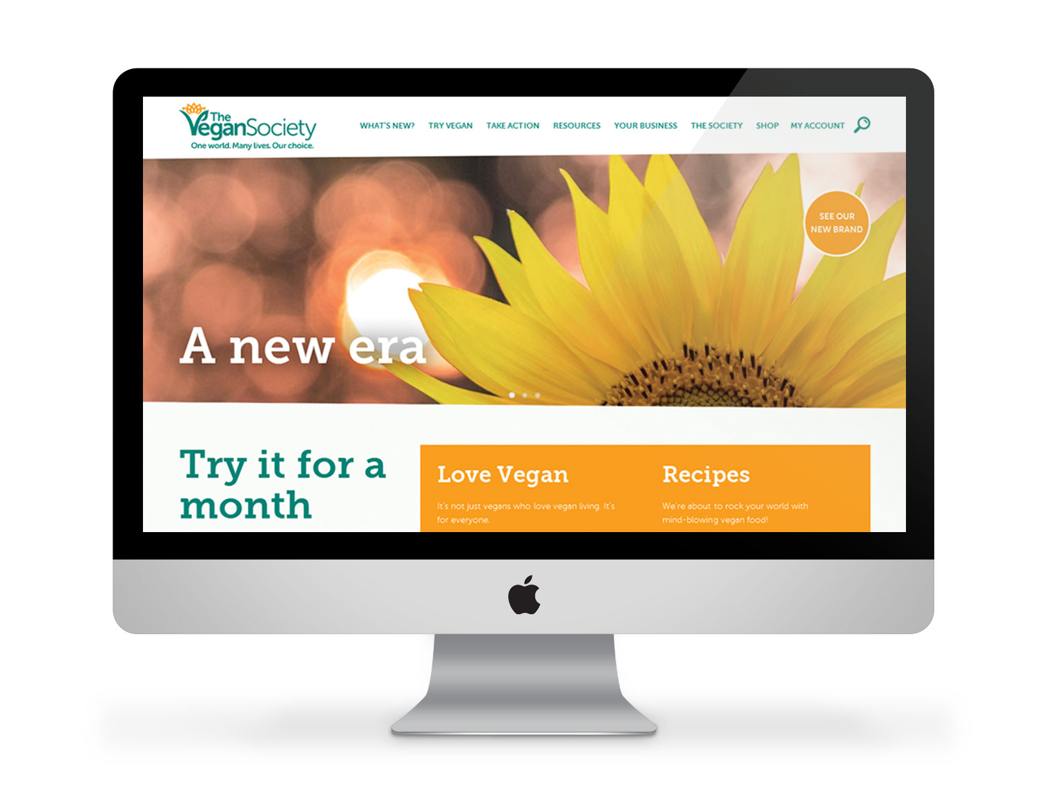
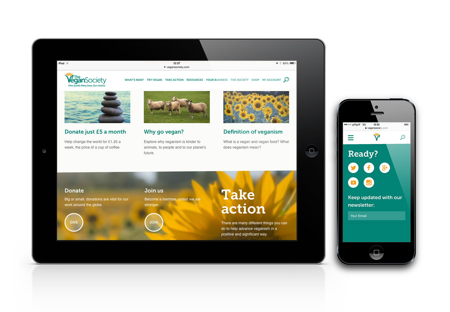
Studio Mashbo interpreted the brand guidelines brilliantly and created a website that worked across all platforms using sunflower photographs taken by Creative Phoenix throughout the site.
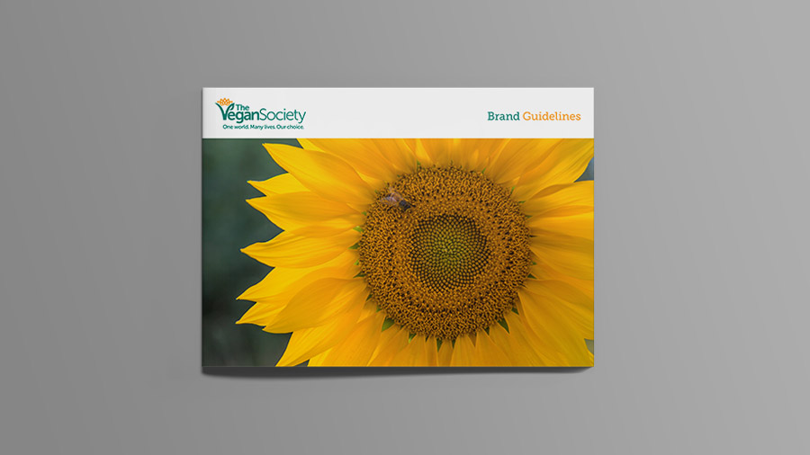
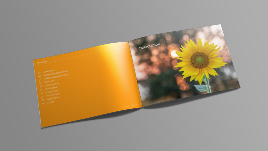
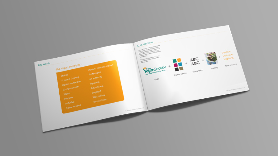
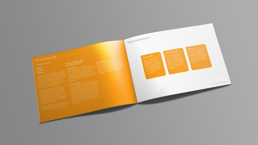
BRAND GUIDELINES
Extensive brand guidelines were written using the sunflower photos. Selected pages are shown.
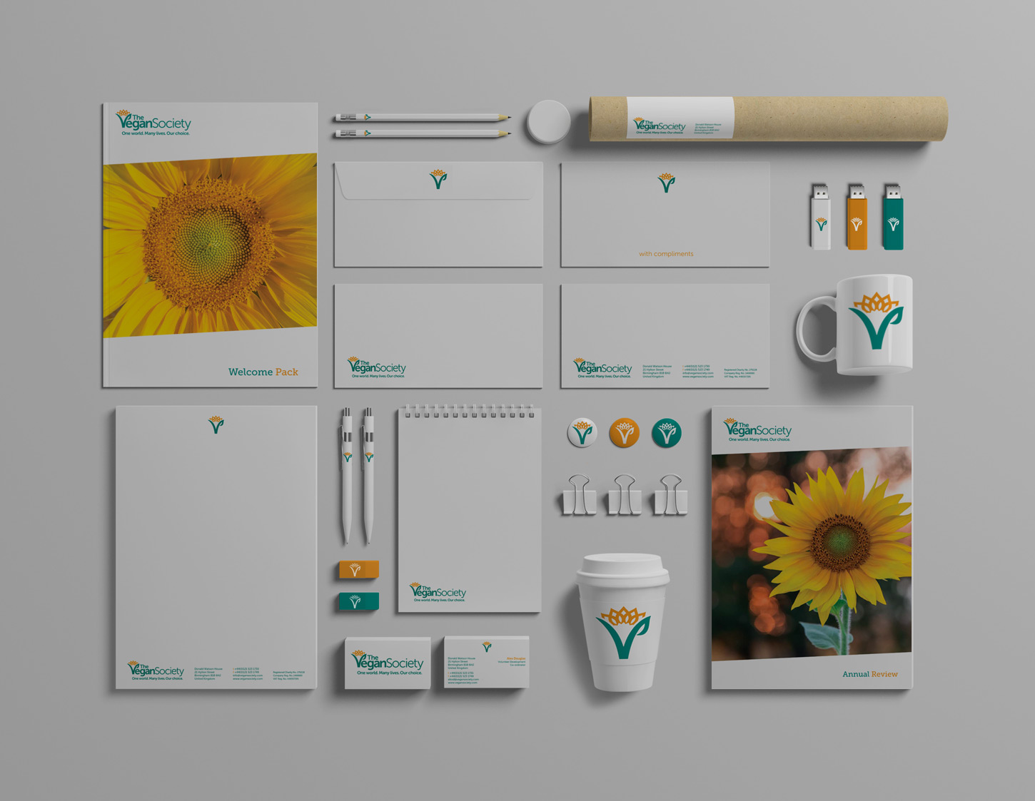
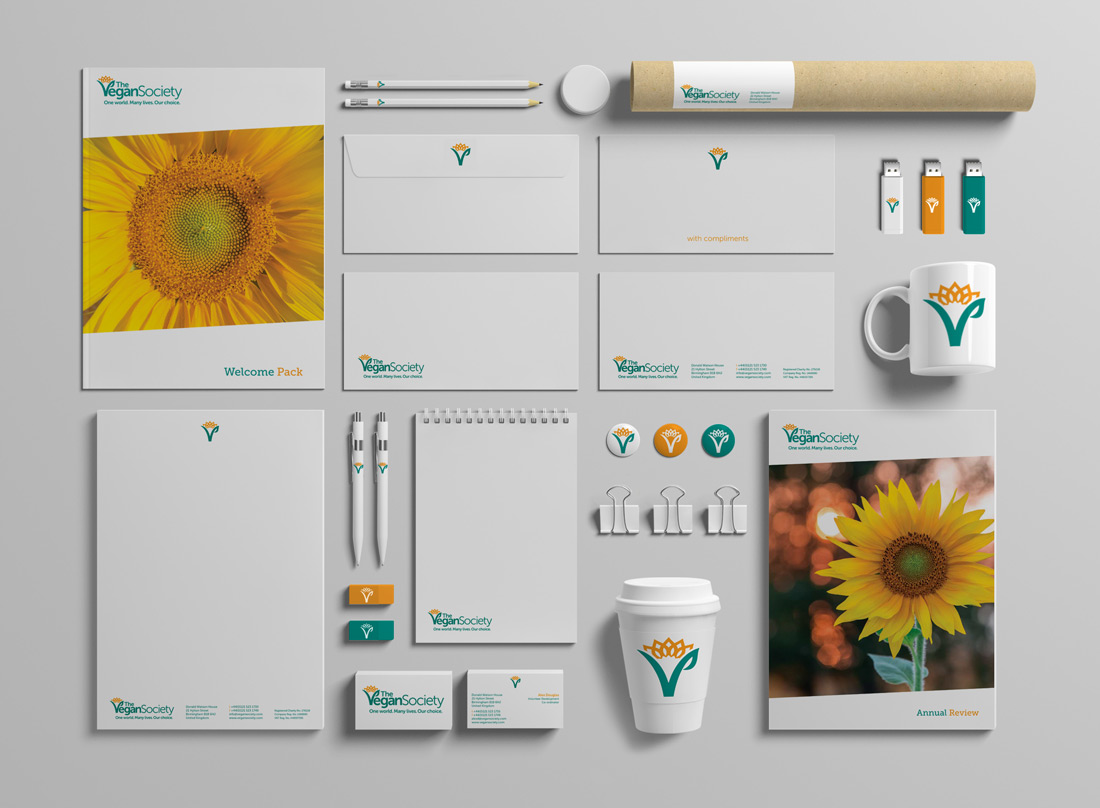
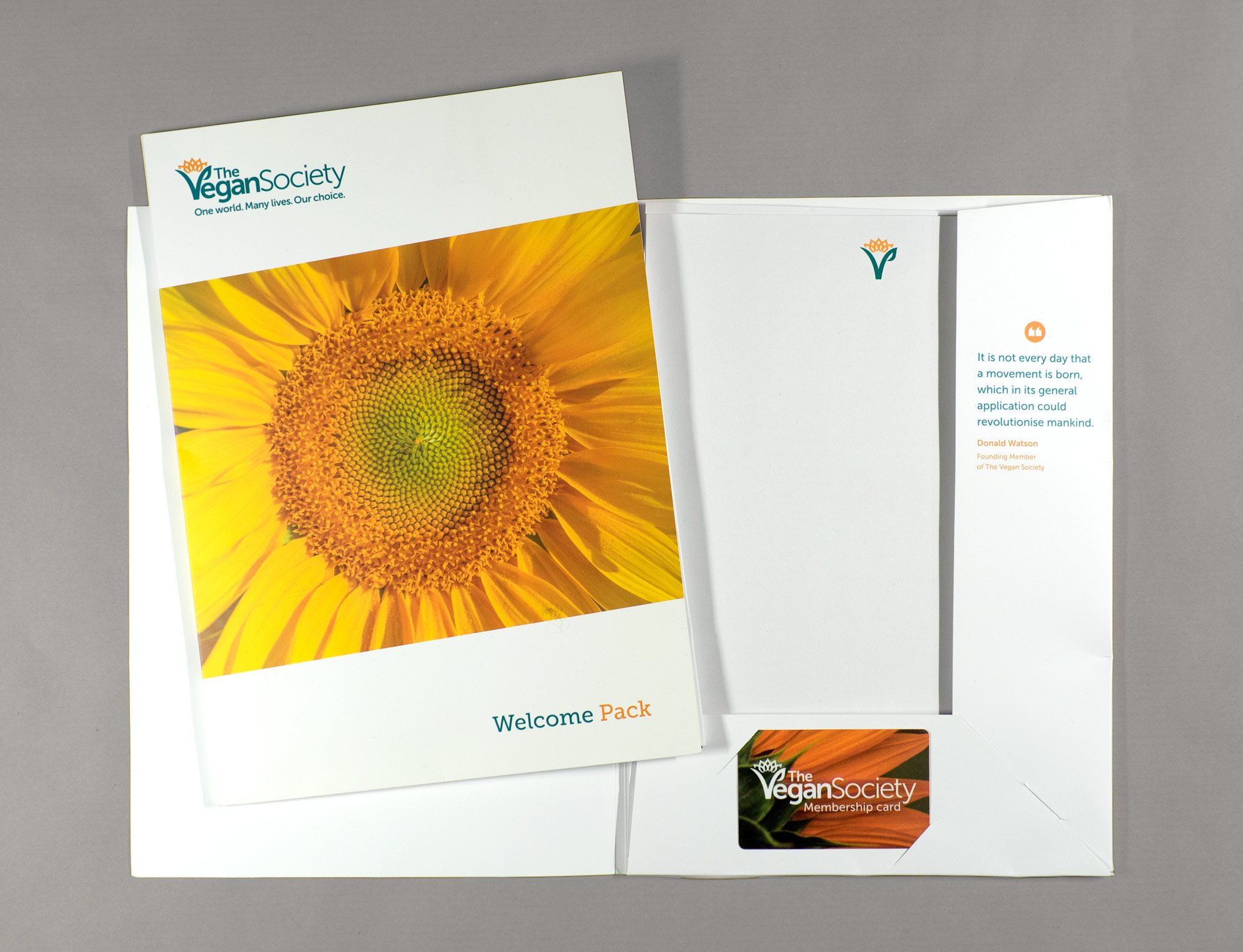
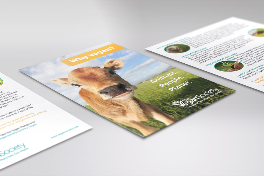
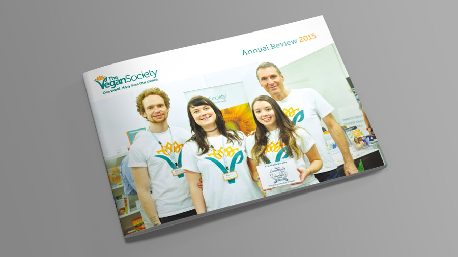
Examples of materials designed including a recent annual review.
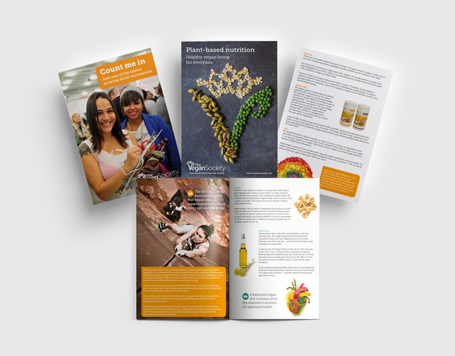
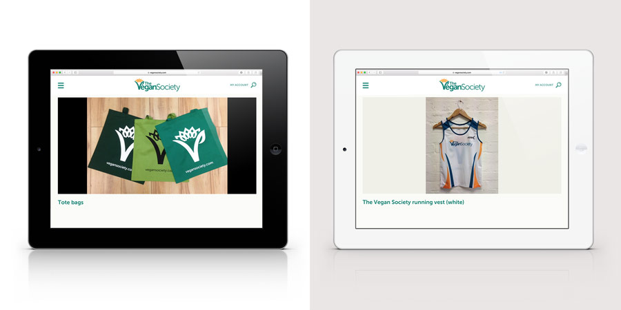
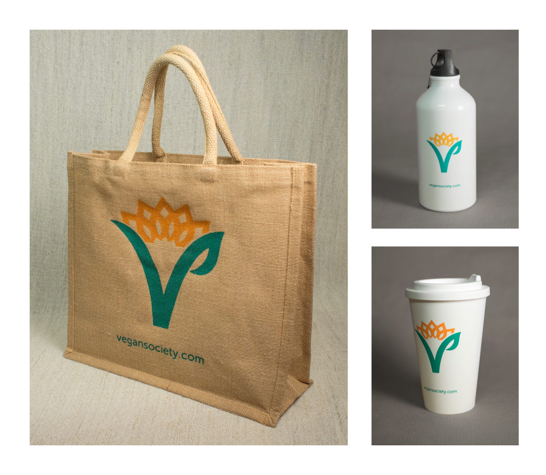
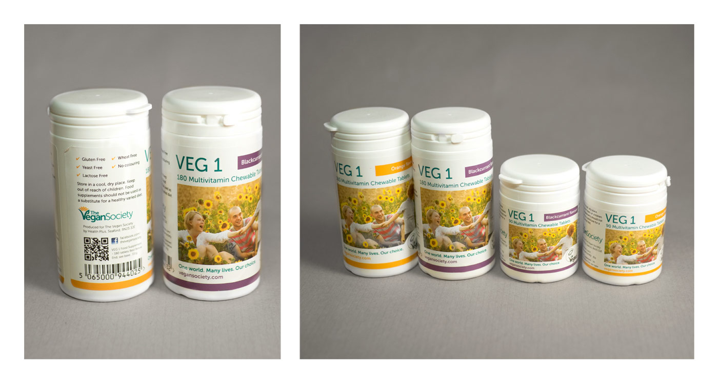
A range of products were designed by the society using the new brand.
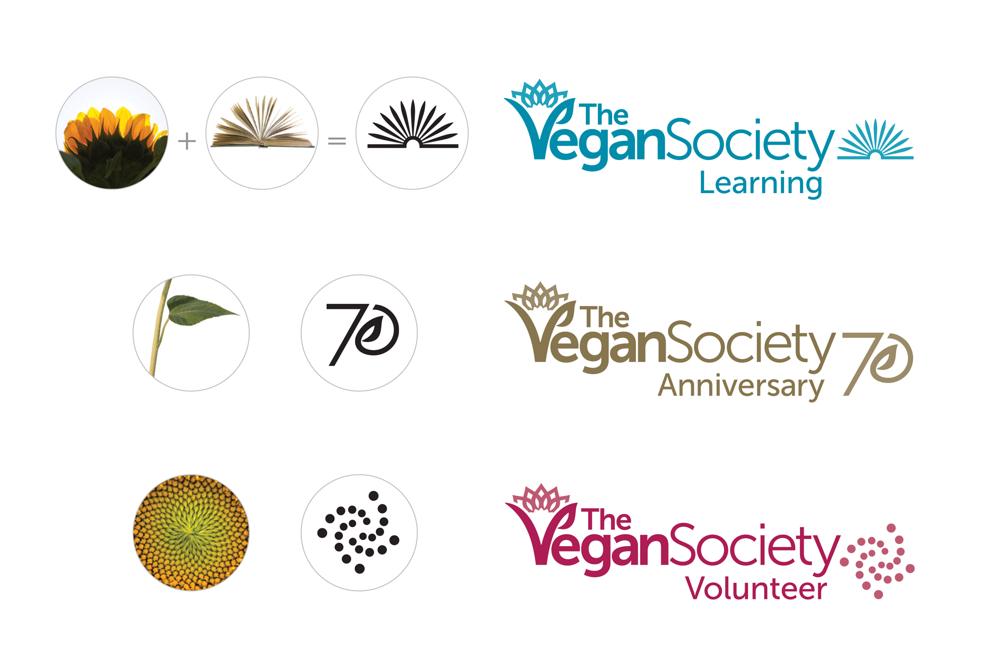
The various logos that the Society uses for different areas of work are all part of The Vegan Society sunflower, showing the Society’s presence as a unified organisation with a clear vision.
Learning. Sunflower petals and an open book are the inspiration for the Learning logo mark. It is instantly recognisable as belonging to The Vegan Society, while offering a distinct and bold symbol of learning.
Anniversary. For the 70th Anniversary logo, a bespoke number 70 was created, inspired by the stalk and leaf shape. This unique mark mirrors the text used in the sunflower logos to maintain brand consistency.
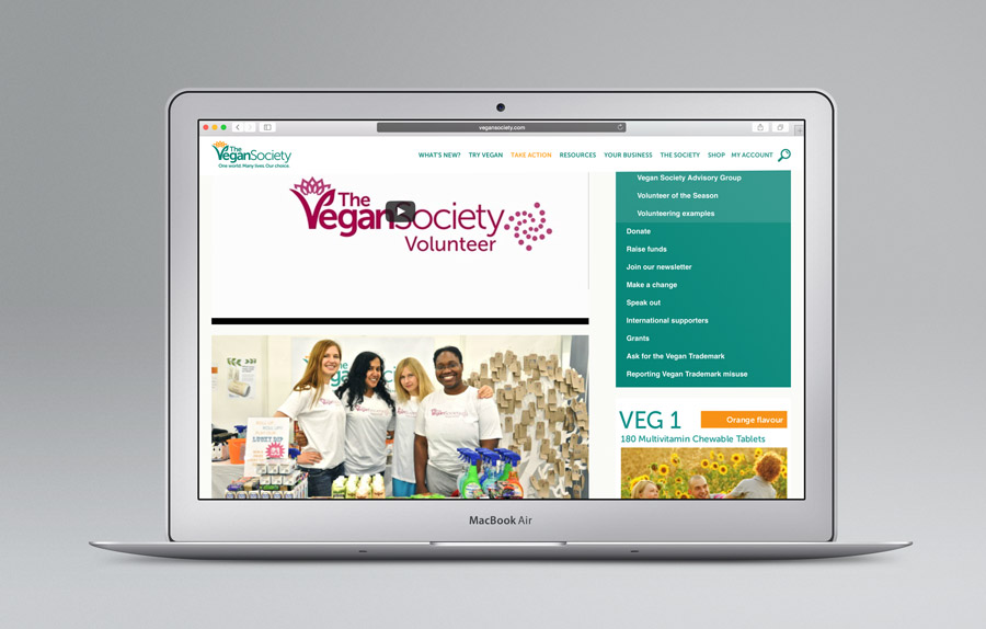
Volunteer. The Fibonacci spiral from the centre of the sunflower inspires the Volunteer mark: the circles or seeds represent the connected volunteers, radiating outwards from the centre of the sunflower.